
Should You Claim Colors for Your Trademarks?
Registering to protect one’s trademark is a must for any business. When determining what to register and how, the analysis is usually and wrongly limited to determining the following:
What should you register as a trademark
Determining the products or services for which one should register the trademark
Where to register your trademark
Does it matter what colors you register your trademark in?
One of the key factors that goes overseen when determining how to apply for a trademark registration is in what color your trademark should be registered. Many times, not considering a trademark’s color when registering it ends up condemning a registered trademark to uselessness.
The general rule in most countries is that the registration of a trademarks grants protection over the trademark exactly as it is registered. That is, if your register a trademark with a specific color or combination of colors, you will not be able to use the trademark as registered if you modify the trademarks in any way.
What does it mean to use the trademark as registered?
- You will only be able to use the ® trademark sign in connection with the trademark exactly as it was registered.
- In most countries if you require to show use of the trademark, for example to defend your trademark registration against cancellation action based on lack of use, the trademark authority will require the use to be for the trademark exactly as it was registered.
Does this mean that if I register my trademark in one color my competition will be able to use the same registered design in another color?
NO. When you register your trademark in a country, you will have the right to prevent third parties from not only using an identical trademark, but also from using similar trademarks that may be used for identical or related products or services.
A simple variation of colors will not, in most cases, make a trademark different enough.
![]()
If a third party were to use the blue trademark to the right for identical or related products or services to those for which the trademark to the left is registered, the owner of the registered trademark will be able to present legal actions against the third party based on trademark infringement.
How do I determine in what color I should register my trademark?
You should register the trademark exactly as you plan on using it. However, companies tend to modify the colors of their trademarks in cases of rebranding or in some cases depending on the products or services that they offer.
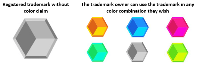
In some countries it is possible to register a trademark that allows you to use the trademark as registered in any color combination you wish.
Should I claim color and how should I submit the image of my trademark?
Whether or not a trademark should be submitted in color will depend on the jurisdiction where you apply for the trademark, and if you wish to claim color. In some countries, by submitting a trademark in color you will be automatically claiming the colors included in the logo, while in others an express declaration of claim over the colors will have to be filed.
We generally recommend that color not be claimed in a trademark, thus allowing the owner to use the trademark in the future in any combination of colors they see fit. However, if the color or colors included in the trademark are the central, predominant and recognizable feature (more so than the design itself), claiming color may be recommended.
Find below some information regarding color claim for trademarks in the different countries that allow this:
Color claim for trademarks in the USA
When filing a trademark in color in the United States through the United States Patent and Trademark Office (USPTO), the color claim will be automatic if the image of the trademark is in color.
If color is not to be claimed for the trademark, this will have to be stated at the moment of filing and the image of the trademark must be in black and white or in scales of grey.
Claiming color in a trademark in the USA will limit the owner’s right to only using the trademark in this color. It is important to note that in the USA use of the trademark will have to be demonstrated throughout the trademark’s life in order for the mark to remain valid. If the owner registers the trademark in one color and when asked to demonstrate use of the mark only has evidence of the mark being used in a different color, the evidence (specimen) of use will be refused. In such case, the trademark will lapse.
Again, use of the trademark must be identical to how it is registered. Changes in color are only accepted if color is expressly NOT claimed.
Why would anybody want to claim color if this simply limits the use or protection they have over the trademark?
Generally, if the trademark consists of a distinctive design feature, color claim is not generally recommended. However, if the trademark consists of a very simple design, such as commonly used geometric figure, color should be claimed. For example, if your logo consisted simply of a circle, you may have problems preventing others from using circles in connection to their trademarks. However, if your circle or simple geometric figure appears with a recognizable color palette, then you should claim color as you will be able to prevent third parties from using such figures with the colors you have claimed.
In most cases, it is highly recommendable to file to separate trademarks. One without color claim and a second registration with color claim, in order to have a greater degree of protection over your mark.
For example, MasterCard International Incorporated:
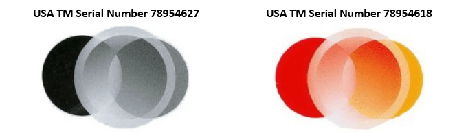
In the first image, color is not claimed as a feature of the mark. For the second, the color(s) red, pink, orange and yellow is/are claimed as a feature of the mark. The mark consists of the design of intersecting circles that fades from red to pink to orange to yellow.
In this case, as MasterCard has registered two separate trademarks of the design, one without color claim, and another with, which allows it greater protection in not only impeding third parties from using the general design, but also other trademarks that, although they may have a different design, may be considered similar in the use of colors. Therefore, in this case there would be protection over the design and color separately, granting a greater degree of overall protection to the trademark.
Visit our website for specific information regarding trademark registration in the USA.
Color claim for trademarks in Canada
When filing for a trademark registration in Canada, an image of the trademark will have to be presented. If the image includes colors, color claim will NOT be automatic. In the moment of filing, the applicant will have to expressly declare they wish to claim the colors of the trademark.
Visit our website for specific information regarding trademark registration in Canada.
Color claim for trademarks in the European Union
When a trademark is filed for registration in the European Union, through the European Union Intellectual Property Office (EUIPO), the trademark will be registered and protected for the exact colors in which it has been presented. An option to “claim color” exists for priority purposes, but it does not affect the protection afforded to the trademark. If the trademark is filed in black and white, it will only be protected in black and white. However, this does not necessarily mean that you will be unable to take action against third parties that use your trademark design while only changing its color.
Visit our website for specific information regarding trademark registration in the European Union.
Color claim for trademarks in China
When a trademark’s image is presented in color before the Chinese Intellectual Property Office, the color claim will be automatic. This will limit the owner’s right to using the trademark only in this color. If the applicant does not wish to claim color, the trademark should be filed in black and white.
If an objection is received during the trademark process in China, use of the mark may help to overcome such objection. However, if color was claimed in the moment of filing, and the trademark were used in different colors, such use would not be taken into account as the trademarks would be considered as different by the Chinese trademark authority.
Visit our website for specific information regarding trademark registration in China.
Color claim for trademarks in Taiwan
When a trademark is filed in color before the Intellectual Property Office of Taiwan, the color claim will not be automatic. The applicant will have to expressly declare they wish to claim the colors of the trademark.
Visit our website for specific information regarding trademark registration in Taiwan.
Color claim for trademarks in OAPI (African Intellectual Property Organization)
The Organisation Africaine de la Propriété Intellectuelle (OAPI), or African Intellectual Property Organization in English, allows for a single trademark to grant protection in the countries of Benin, Burkina Faso, Cameroon, Central African Republic, Chad, Comoros, Republic of the Congo, Equatorial Guinea, Gabon, Guinea, Guinea-Bissau, Ivory Coast (Côte d'Ivoire), Mali, Mauritania, Niger, Senegal and Togo).
In OAPI, if the logo is filed in color then the color claim will be automatic; however, there will be a surcharge in official fees for the color publication. If the applicant does not wish to claim color, they will need to file the logo in black and white or scales of grey.
Visit our website for specific information regarding trademark registration through OAPI.
Color claim for trademarks in Switzerland
When a trademark is filed in Switzerland through the Swiss Federal Institute of Intellectual Property, the color claim will not be automatic if the image of the trademark is in color. In the case of trademark registration in Switzerland, in order to claim color, the applicant will have to expressly declare they wish to claim the colors of the trademark and clearly name all colors that are included in the trademark.
Visit our website for specific information regarding trademark registration in Switzerland.
Color claim for trademarks in Thailand
When a trademark is filed in color before the Intellectual Property Office of Thailand, the color claim will be automatic. This will limit the owner’s right to only using the trademark in this color. If the applicant does not wish to claim color, when applying for the trademark in Thailand, a black and white version of the trademark will need to be presented.
Visit our website for specific information regarding trademark registration in Thailand.
Color claim for trademarks in the Philippines
In the case of the Philippines when a trademark is filed in color before the Intellectual Property Office of the Philippines, the color claim will NOT be automatic. The applicant will have to expressly declare they wish to claim the colors of the trademark at the moment of filing.
Visit our website for specific information regarding trademark registration in the Philippines.
Color claim for trademarks in Ecuador
In Ecuador, if a trademark is filed in color, the color claim will not be automatic. The applicant will have to expressly declare they wish to claim the colors of the trademark.
Visit our website for specific information regarding trademark registration in Ecuador.
Color claim for trademarks in Ukraine
In Ukraine, if a trademark is filed in color, the color claim will not be automatic. The applicant will have to expressly declare they wish to claim the colors of the trademark.
Visit our website for specific information regarding trademark registration in Ukraine.
---
iGERENT offers trademark services in more than 180 countries.
